Your calls to action, or CTAs, are arguably the most important part of your copy. Your CTAs guide users through your marketing funnel, giving them clear instructions on what to do next. They are also the key to transforming leads into valuable conversions.
Because it’s so vital to get your CTAs right, you should spend some time making sure they’re optimized in terms of wording, color, positioning, and other factors.
Optimizing your CTAs is a task that’s part art and part science – it’s not always possible to predict what will work (although split A/B testing will help you determine this for sure.) However, there are some recommended best practices you can follow. They will give you a head start on optimized CTAs and make sure you don’t waste your time with ineffective copy and graphics.
Quick Takeaways:
- Keep your CTAs short while urging “quick” action.
- Personalization has been shown time and again to increase conversions.
- Buttons convert better than text, links, or images.
- Make sure your landing pages back up your CTA in terms of content and offers.
- Never stop testing your CTAs.
1. Be Brief
CTAs that are too long and wordy are ineffective. Generally speaking, you should keep your text short and sweet and stick to the point. Keep your CTAs to no longer than four words if possible. You can make the most of this limited word count by using strong verbs. Some examples of short generic CTAs that work well include “get started”, “learn more”, “join free”, and “buy now”.
2. Create Urgency
Creating a feeling of urgency or scarcity is a well-known and effective trick for boosting conversions. There are a few different ways you can do this:
- Use time-related language: “shop now”, “start now”, “sign up today”.
- Use words like: “limited”, “reserve your spot”, “last chance”, “sale ends tomorrow”
- Add a countdown timer to show when offers are expiring.

In general, you want to create a “FOMO” (fear of missing out) that will prompt users to complete the action or risk losing whatever you’re offering forever.
You can also try to ‘sweeten the deal’ by offering something in exchange for taking action. Throw in incentives such as discounts, a gift, or free shipping. This can be a limited time offer as well.
Offering a little extra might just be the little push a prospect needs to get them to buy your product or service. It doesn’t have to be over-the-top, just enough to convince visitors to click the “buy” button, fill out the content offer form or sign up for your newsletter.
3. Try Reverse Psychology
You’ve probably seen this type of CTA on a website pop-up. It’s become very popular in the last few years, purely because it works so well.
The idea is to offer the user two choices. Rather than a simple “yes” or “no”, use the power of reverse psychology to push the user towards the action that results in a conversion for you.
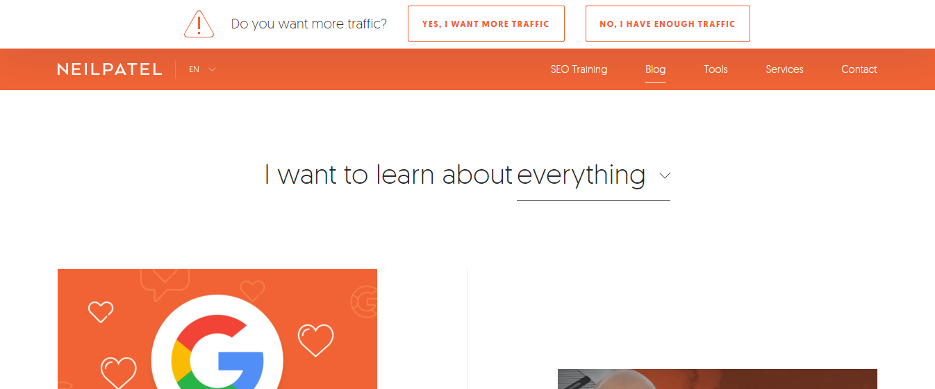
There’s a great example of this trick on Neil Patel’s blog, which offers readers tips and tricks to boost traffic and conversion rates. A question asks simply: “want more traffic?” with two options available: “Yes, I want more traffic”, or “No, I have enough traffic”.

Clearly, no website owner will ever turn down the opportunity for more traffic. Reading this causes the user to stop and think about the opportunity they’re turning down rather than simply clicking “no” to dismiss the popup.
4. Personalize Your CTAs
Personalizing your CTAs can boost your conversion rate by over 200%. This doesn’t mean that you should put “Click here [firstname]!” everywhere, but it pays to use the data you have available and subtly adjust the wording of your CTA depending on user location, whether they’re an existing customer or new lead, and other relevant factors.
5. Use Responsive Design
Remember, it’s likely that at least half of your users are browsing your site or reading your email on a mobile device. You should be using responsive design so that your communications are easy to read and navigate on small screens anyway, but this is doubly important when it comes to your CTAs.
Before you publish, make sure that you’ve checked the placement and appearance of your CTAs on a variety of screen sizes and software agents. An ideal position for your CTA is high on the page and in the middle column. This is where most people’s eye go when they visit a landing page.
A button that’s been scaled down along with the rest of the site can easily be skipped over on a small screen. Make sure that it’s still visible and stands out clearly. Even better, make sure your CTA is visible on every page of your website. You don’t want to make your prospect work to get in contact with you.
6. Utilize Contrasting Colors and White Space
To be effective, you need to make sure your CTA stands out against everything else on the page. Using contrasting colors is the easiest way to do this. If your CTA is the same color as the rest of your text, it will blend into the background.
Using plenty of white space around your CTA also helps it to stand out more. Size also matters – make your CTA text bigger than the surrounding text.
Your CTA should be the first thing that the user notices on the page, so don’t surround it with lots of images and other distracting elements. Try to make sure the design draws the eye towards the CTA.

7. Make Your CTAs Into a Button
There are many different ways you can design your CTAs with plain hyperlinked text, graphics, or photographs, but buttons convert the best by far. In fact, conversion rate optimization experts Crazy Egg go so far as saying:
“The call to action is so important, so essential, and so overwhelmingly powerful that you should not attempt to make yours anything but a button.”
This is because the human brain is wired to expect action when a button is pressed. Buttons are also quite tempting – we really want to press them (imagine the temptation of a big red button combined with the reverse psychology trick of “don’t press this button!”)
You can experiment with your button design and colors but in general, your CTAs will work best in the form of some kind of button.
8. Double-check Your Landing Pages
There’s no point in having a super-effective CTA if the user clicks it and it goes to a broken page. After you’ve finished building your webpage or email, make sure you click through all your CTAs and check that the links are going to the right page and all forms are working properly.
9. Test and Refine
It’s unlikely that you’ll be able to create a perfectly optimized CTA right off the bat. Instead, this is an ongoing process and you should be testing and improving your CTAs continuously as you learn more about what is most effective for your particular audience.
A/B testing is the traditional way to do this – split your audience in half and show them two different versions of your CTA. The version that converts the best wins. Don’t change multiple elements at once but compare variables such as color, placement, and copy individually.
There is also now an alternative to A/B testing that’s worth investigating. Software powered by artificial intelligence can automatically optimize your CTAs in real-time, based on the interactions of each user. This method of optimization is just as effective as split testing (if not more so) but it also allows you to create an optimal CTA much faster than with traditional testing and optimizing cycles.
So, you’ve learned how to perfect your CTA, now you want to make sure you have the content to back it up. Check out our SEO Blog Writing Services or schedule a free consultation today to learn more about perfecting your content marketing strategy.
The post 9 Best Practices for Optimizing Your Calls to Action appeared first on Marketing Insider Group.
0 Commentaires